WebP, an image format optimized for the web

WebP is a raster image format developed in 2010 by Google and made available to the public.
It is added to the list of image formats you already know on the web:
- png (Portable Network Graphic) format, developed in 1996 to replace the GIF format,
- jpeg format (Joint Photographic Experts Group) dating from 1992.
The notion of matrix designates a compressed image format as opposed to native image formats made up of a juxtaposition of points (pixels) of a given colour. As with any raster format, displaying an image in WebP format on the screen requires a calculation by the browser to transform this image format into pixels.
The WebP format has several advantages:
- it provides better image compression than png and jpeg formats (about 25% space-saving),
- this supports lossless compression (like png format), and lossy compression (like jpeg),
- it manages the transparency of the image (like the png format while the jpeg format does not allow it).
Note: transparency allows you to manage transparent areas on images to reveal the background.
Should you use WebP for your website?
Undeniably yes. For the following reasons.
For page load time
The majority of the display time of a web page is related to the loading of the illustration and decoration images.
The more big images your site uses, the more your Internet user will have to wait to discover your page.
The use of the WebP format, well implemented, will allow you to considerably reduce its waiting time.
However, Safari (Apple) or Internet Explorer (Microsoft) does not currently support it.
Before even thinking about making your site WebP compatible, it is important to be attentive to the dimensions and the resolution of the images (density of the points expressed in dpi) that you use.
Changing the dimensions and resolution of images is easy:
- there are many sites online that offer you to resize them and change their resolution,
- some CMS integrate these features (natively or using plugins),
- under Mac Os X, the native “Capture” application is very efficient (Tools / Adjust size menu),
- under windows, the “Paint” tool can help you out,
- professional tools exist Photoshop or its open-source equivalent Gimp.
This is about acquiring good reflexes, valid whatever the image format used.
Your site is probably already designed in responsive mode (its presentation of the pages adapts to the “screens” used: tablet, mobile, desktop).
The responsive approach has integrated new development constraints concerning images. If used on a large screen or a smartphone, a well-designed site will select the most suitable image size. It is indeed counterproductive to load a very large image on smaller screens. In some cases, we adapt the back offices of our clients’ sites so that contributors can load different images for the mobile site and the desktop version. In addition to performance considerations, it is thus possible to offer image versions with different framing depending on the terminal used.
For the quality of the images
The WebP format without loss of quality has a better compression rate than the jpeg format (with loss of quality), you can offer your Internet users a better quality image for a lower weight than the jpeg format (or keep an equivalent quality for a significantly lower weight).
For natural referencing
Among the many criteria favourable to the natural referencing of your site (SEO), the loading time of the pages becomes a major criterion.
If your site is “slow”, Google will consider your Internet users to be penalized and will rank your site after those of your competitors.
For the images considered, we observe 2 gains:
- The jpeg images used by the safari browser represent a total weight of 1.2 MB and a total transfer time of 6.3 seconds,
- The WebP images used by the chrome browser weigh 526 KB (less than half), for a total transfer time of 3.3 seconds.
The Internet user will wait half the time for the page to be displayed, for more than half the network load.
In this, you also need the usage of “lazyload.js”. This is also an optimization of the display time of the page to the Internet user: Images are progressively loaded by scrolling the page. The browser waits for the user to move down the page to load the images below the visible area.
Are there competing image formats?
Unsurprisingly, the answer is yes!
The most serious competitor to WebP has been developed by a group of experts “Moving Picture Experts Group”. Responsible for the development of international standards (ISO) for compression, decompression, processing and coding of video and audio.
This is the HEIF (High-Efficiency Image File) format adopted by Apple.
It has been available since late 2017 with iOS version 11 or later, and macOS High Sierra or later.
If you are a Mac user (iPhone, iPad, MacBook, etc.) you are already familiar with this image format. In particular, it allows you to offer Live Photos: when you take a photo, the live photo allows you to record a sequence of photos before and after your trigger.
A WebP the same as the format, supports both modes, with or without loss of quality, and allows compression comparable gains.
Note: “jpeg” 2000 jpeg2000 version was not as successful as expected this format is only compatible with Safari (Apple) browser.
What are the principles for implementing the Webp format for your site?
Google provides explanations and recommendations to developers.
This implementation should be assigned to the designer of your site.
Plugins are offered in WordPress.
The designer of your site can choose to use a plugin or implement WebP using the libraries made available by Google.
It will also have to adapt each template of your site, each image display area, to select the image dimension best suited to the display area, taking into account responsive breakpoints.
It will also handle exceptions for browsers that do not support this format.
These interventions represent a longer or shorter working time depending on the number of templates (page models) on your site.
This investment remains very interesting in terms of improving the user experience and SEO optimizations.
Which internet browsers support the WebP format?
The answer is provided to us by the Can I Use site, which offers live monitoring of this information.
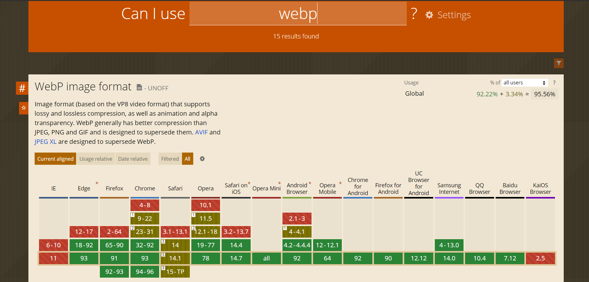
As you can see the latest versions of the majority of browsers support WebP.
The 2 exceptions are safari (Apple), under iOs and MacOs, and Internet Explorer (Microsoft).
For these 2 browsers, the designer of your site will offer the traditional png or jpeg formats.
The bottom screenshot indicates that Apple is in the experimental phase to support WebP in Safari.
Is WebP good for the environment?
The Wikipedia article on WebP mentions that “according to Google, 60% of the bytes transmitted on the web are images”. This statement is surprising when we look at the distribution of downlink traffic on the Internet in 2019.
It would be legitimate to bring the traffic linked to images closer to 13% of the traffic associated with website.
Even with a more reasonable figure of around 10% (considering that 80% of the weight of the pages is attributed to images, and 20% to texts) the reduction of nearly 30% in consumption linked to the better compression of the images remains interesting. This 3% represent double the total traffic generated by couriers.
If Apple has chosen an optimized image and video format (cf. HEIF / and HEVC for High-Efficiency Video Coding), it is because the stakes are high. Each percentage of weight reduction represents colossal volumes for its cloud storage spaces).
The disadvantage of optimizations images is the calculation time required for your phone or computer to interpret WebP images.


