


Wall coverings generate visual interest by adding Pattern Wallpaper, texture, and accent color to a room. They are a dramatic way to define a room’s style. With the right pattern, you can totally change the appearance of an entire room!
For example, a bold abstract print immediately establishes a contemporary style, while a small floral design will suggest a more traditional or country theme.
Small Prints Pattern Wallpaper
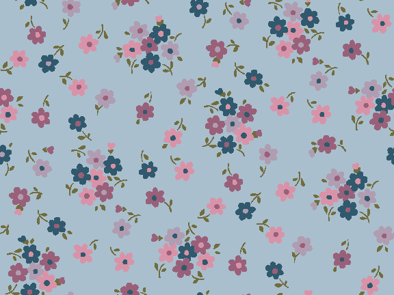

Small prints add a touch of pattern to the overall background color, forming a subtle backdrop. Mini prints in light, cool colors and fine textures applied to the walls and ceiling create a feeling of more space in a small room. If the mini print is in a warm, dark color, the opposite response occurs. Pattern Wallpaper with small prints is often used in kitchens, bathrooms, and other small spaces.
Large Prints Pattern Wallpaper
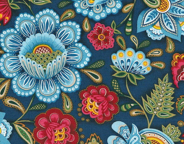

Ready to make a statement? Large dense prints add the most visual excitement to a room. These bold designs often prove the most memorable, leaving a lasting impact on your guests. You can treat large designs like wall art, adding flair to rooms of any size. If you want a room to feel smaller and more intimate, large print wallpaper will help accomplish your goal.
Large Open Pattern Wallpaper


Time for a breath of fresh air. Large, open patterns feature a pattern spread out over a light background, opening up a room and tying it together. Subtle patterns in this style act much like lighter colors, brightening and warming a room. Combine open patterns on the walls with a light ceiling to retain a sense of height when design elements have a vertical thrust.
Geometric Prints Pattern Wallpaper


Bring order to your design. If your room needs a focal point, geometric wallpaper will be perfect for the job. Geometric prints give a lasting impression of continuous space when applied to all the walls. This category includes bold shapes, sharp angles, plaids, and grids. Large geometric patterns can be bold and exciting, while small patterns can be subtle and peaceful.
Vertical Lines Pattern Wallpaper
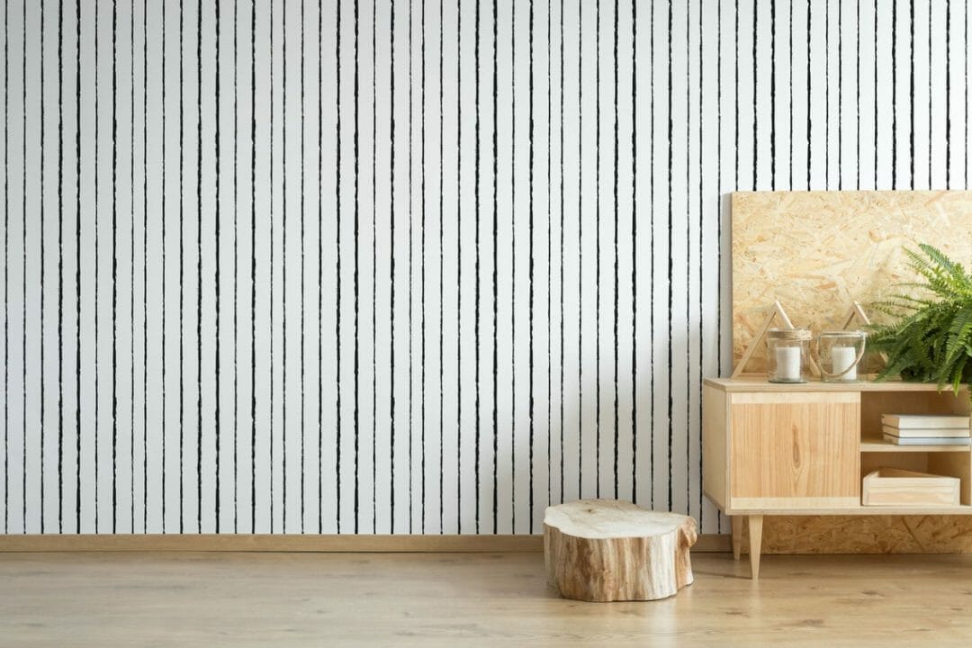

Pattern Wallpaper with strong vertical lines or stripes remains a timeless choice. From thick bold stripes to classy pinstripes, vertical striped wallpaper provides the perfect backdrop for your interior design. Choose from classic two-tone lines, multicolored stripes, or exciting non-traditional stripes. Use vertical stripes to make a low ceiling seem higher.
Horizontal Stripes Pattern Wallpaper

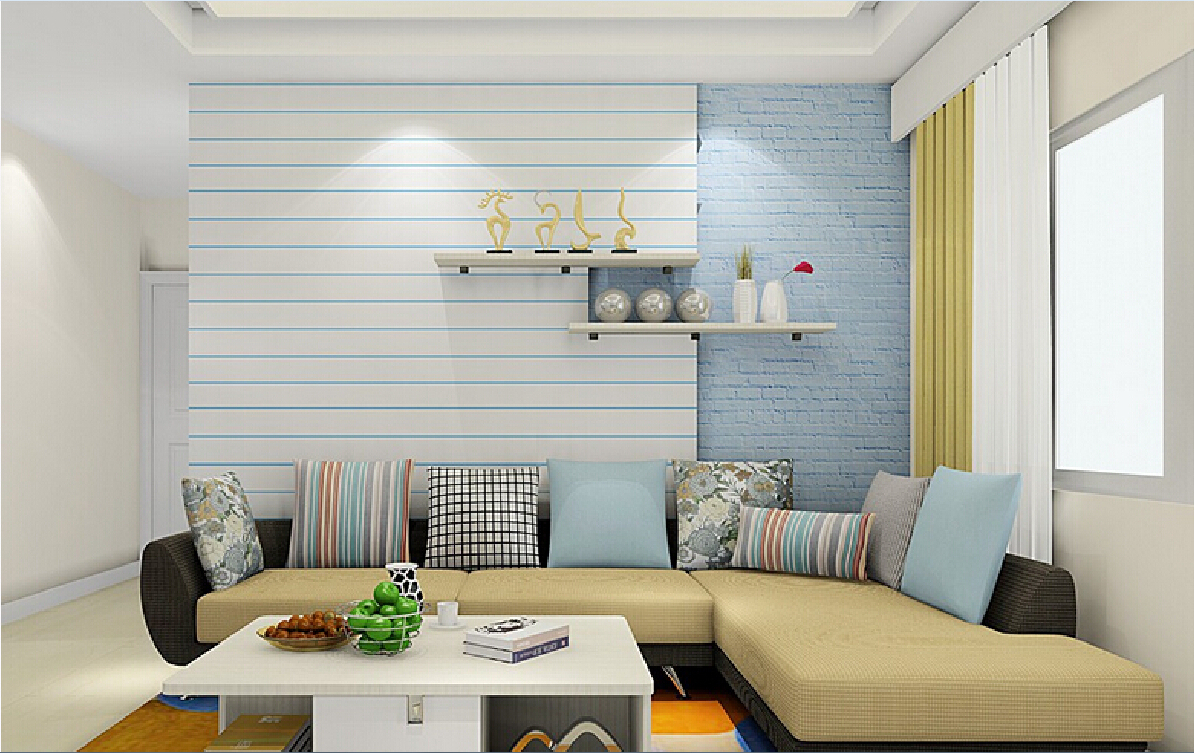
Horizontal stripes make a room seem wider. They come in as many varieties as vertical wallpaper, allowing you to match the color, tone, and feel of your room. The right horizontal striped wallpaper can make your design elements truly stand out. Remember that any vertical stripe wallpaper can be hung horizontally — those in the know call this technique “railroading!”
Diagonal Stripes Pattern Wallpaper

/stripes-2-587e8afb3df78c17b6b8e71e.jpg)
Want to create a dynamic feeling of motion? Diagonal stripes direct focus in a room and create a fun sense of movement. If you love stripes but want something a little different, try a diagonal design. Much like you can hang vertical wallpaper horizontally, you can hang any striped Pattern Wallpaper at a carefully measured angle to create playful diagonal lines.
Textured Pattern Wallpaper

:max_bytes(150000):strip_icc()/Homepolish-interior-design-3d0e0-5b0eefc78e1b6e003ea34891.jpg)
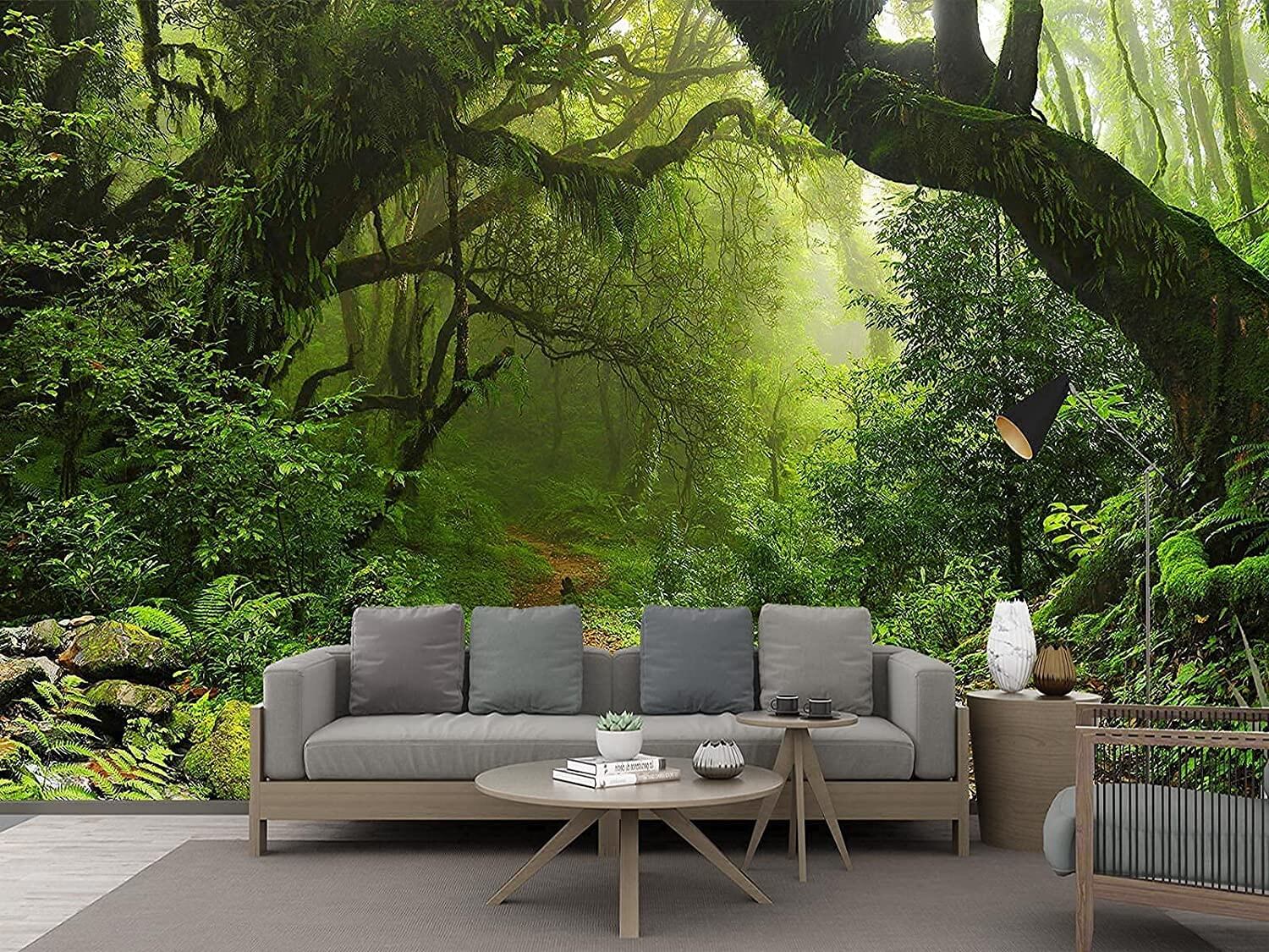
Bring life and character to a room with textured wallpaper. Textures like a heavy grass cloth or expanded vinyl create dimension, interest, and tactile surfaces. This is a clever way to introduce shadows and color variations for a more appealing wall surface. Rich textures tell a story and give a history to your walls. Use textured wallpapers when you want to add real depth to a room.
How Will Wallpaper Colors Affect My Room?

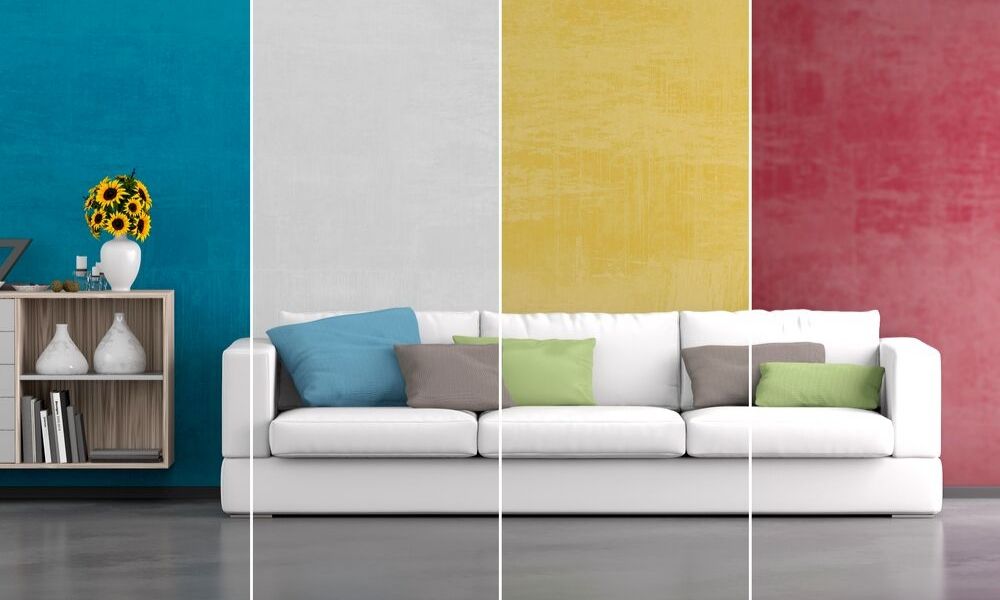
A good general guideline for choosing the color scheme of a room is to look at what you already have. We call these your “givens.” What is in the room now that must stay? You may have a piece of artwork, a prominent piece of furniture, or flooring that guides the color scheme. If you’re decorating a room without any givens, you have a blank canvas! We are here to help you choose the colors that will define your new room.
Also, Read: How to Choose A Pattern Wallpaper For Home Decor
TIP!
Explore the color scheme of your favorite clothes in your closet to see which colors you personally prefer!
How To Use Color Theory to Choose Pattern Wallpaper
Successful interior design almost always starts with the intended use of color. Certain color combinations are more pleasing to the eye. You have probably experienced the effect color can have on your emotions or mood. If you are intentional with your color choices, it will make a huge difference in how much you enjoy your new room. With the help of color theory, it’s easy to find colors you’ll love. Let’s look at your options!
Warm Colors Pattern Wallpaper


Reds, yellows, oranges, and peaches are warm colors. Intense warm colors create exciting spaces, while subdued warm colors set the stage for pleasant social gatherings. Warm colors are often used in eating areas like breakfast or dining rooms to encourage a pleasurable experience.
Warm colors help make north rooms more inviting. They advance toward the viewer. Research has shown that people actually feel warmer in a room painted with yellows, reds, or oranges than they do in a white or blue room. In colder climates, warm colors are a popular choice.
Cool Colors Pattern Wallpaper

Blues, greens, lavenders, and grays are cool colors. They appear to recede or appear farther away, helping to enlarge a room. Intense cool colors are fresh and dramatic, while subdued cool grays are tranquil. Cool colors make rooms feel less confining. They are often used in bathrooms and other small rooms.
Use cool colors in west-facing kitchens, porches, and other areas where afternoon heat is a problem. In very warm climates, using white and cool colors exclusively can make an entire house seem more comfortable.
Light Colors Wallpaper


Light colors create bright, spacious rooms. To the eye, light colors seem to recede, making rooms appear larger and ceilings higher.
Since light colors reflect the most light, they can brighten a north-facing room, a closet, or a dark hallway. White walls form a neutral background that does not compete with furnishings.
Wall roughness and paint sheen can affect the lightness of any color. Smooth surfaces and gloss paints reflect maximum light to make a color seem lighter. Rough-textured walls and flat sheen paints hold more shadow and minimize the lightness of a color.
Dark Colors Pattern Wallpaper


Use dark colors to create an intimate room. Because dark colors absorb light, walls appear closer to make the room seem smaller.
Darker colors can be used to disguise problem areas such as uneven walls or to make a high ceiling seem lower. In heavy-use areas, dark colors can help hide wear. Rough surfaces and flat paint finishes make colors seem darker because they absorb more light.
Dark walls tend to dominate, so you may choose to use lighter-colored accents to add balance to a room. When the walls are dark, it is a good idea to tint the ceiling paint slightly with the wall color to make the room blend and work together.
Bright Colors Pattern Wallpaper
:max_bytes(150000):strip_icc()/Margot-Horizontallifestyle-Hires-cdce778337e8499ab7696df7d977de95.jpg)

Bright colors are highly saturated with pigment. They are not diluted by white or darkened by black. Bright colors work well in active spaces like recreation rooms, sun porches, and children’s rooms. Because bright colors draw attention, they are often used as accents in rooms with neutral or subdued color schemes.
Subdued Colors Pattern Wallpaper

Subdued colors are less saturated with pigment than bright colors. They are blended to include mixtures of white, black, or gray. Subdued colors are relaxing and restful, are frequently used in studies and bedrooms, and form a soft background in bathrooms and dressing rooms. You can increase visual interest in a subdued room by adding a few brightly-colored accents.